(I started this blog on Tuesday but only got half way through so just started again and wrote everything for the two days on Wednesday- sorry about the length)
Tuesday, 22nd May, 2018
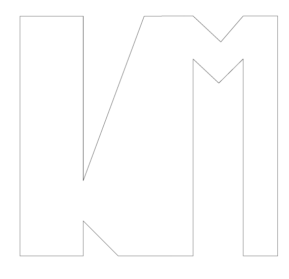
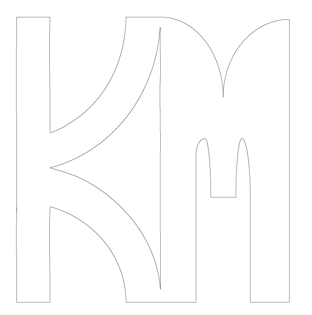
In Tuesdays class, Marcus showed us the different techniques and uses of illustrator and the abilities of vector drawings. For example, laser cutting shapes out of wood or 3D printing to make either final products or example models of larger items. For homework, we were asked to “create three vector drawings that can be used to create a laser cut version of your initials”. These are my drawings that I created:

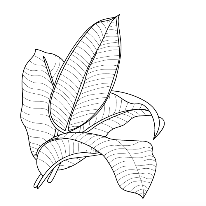
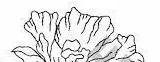
After our break, we worked on our final project of the initials again. I wanted to continue to experiment with the palm leaves, which last week was just a bit of fun trial. I found an image off of google and decided to trace it with a bit more care and detail than last weeks image. This is the image that I found: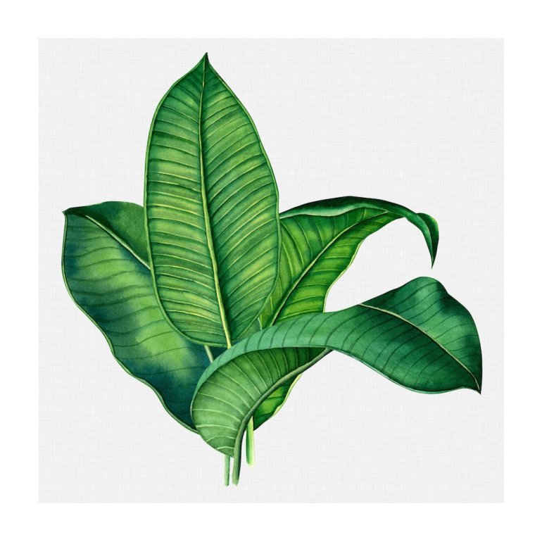
I used the ‘paint’ tool to firstly outline the entire image, emphasising the shape and outline of each leaf. I then used either the ‘pencil’ or line tool for the inside lines; the tool I used depended on the straightness of each line. For some sections of the smaller lines, I held down option and just dragged and repeated the same line (to save time and create unison). Here is the image I created:
An issue arose when I tried to colour this image, as I was unable to separately colour the thick vs. thin lines as I had made all the lines in one layer, instead of two. To fix this issue, and be able to colour the thick lines differently to the thin, I had to copy the image and paste it on another, separate layer. From there, I locked one layer, and then deleted all of the thick lines, keeping only the thin. I then did the same with the other layer, but instead of deleting the thick lines, I deleted all the thin inside ones. I could now colour the exact lines I wanted to, and then reveal all the layers to show the entire image. The only problem with this is that it was no longer an entire image, so I had to copy and paste the lines all onto one final layer.
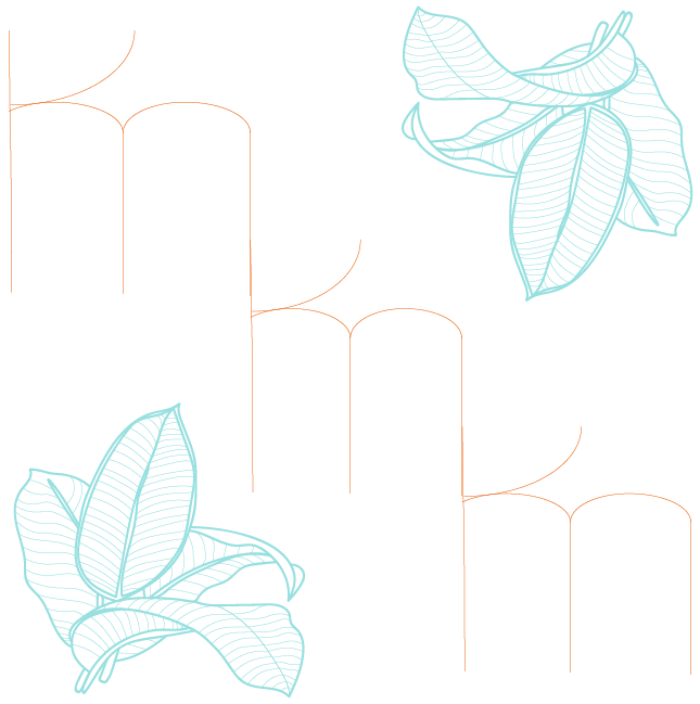
I then created a simple version of the initials to lay over the leave design. I wanted to keep the initials simple, as to contrast and juxtapose the intricate and detailed background. I played around with different colour schemes and the spacing and sizing of the initials and leave design and ended up creating these three images:

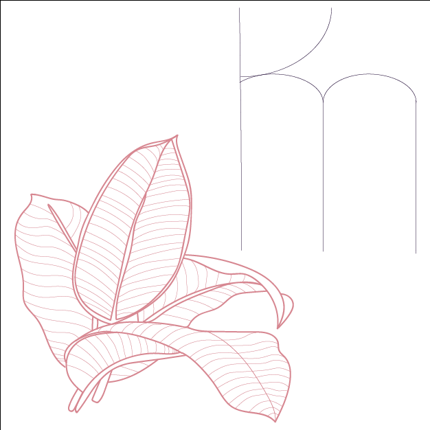
I actually really like them! They sort of look like a surf company logo, like billabong or something. I probably won’t use them for my final project, just because they are a bit more simple than what I would like to present, but I guess that is good because I now know I want to create something a bit more full, perhaps thicker initials and more colour.
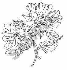
After creating these three images, I decided to play around with the use of a flower; inspired by the original sketch. I found this image and the outline/top of it made me think of slime, sort of like ‘Currents’ the Tame Impala album. I decided to trace only a fragment of the top half of the flower, and repeat it with different colours to make a sort of slime effect.
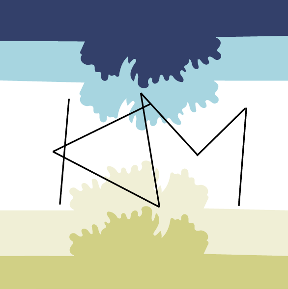
(FIRST IMAGE) I first outlined the part of the flower that I liked, then connected it to the edges with straight lines. I made the ‘stroke’ weight bigger, just for aesthetic purposes, and then grouped all the lines, and Marcus helped me (I can’t remember what he did now…) to make a solid shape that can be filled (creating lines on the sides and bottom if that makes sense). I repeated this shape a couple time and found a colour scheme that I liked, filling in the shapes in a gradient of colour that got gradually lighter. I left a larger space at the bottom to place the initials in. For this image, I decided to yet again create another set of initials. I first started with simple lines and then with the white arrow, used the anchor tool to drag the lines into unusual places. I actually really liked the way this turned out, because I didn’t have any vision for it and it ended up surprising me, looking quite funky.
(SECOND IMAGE) I made another image with the same shapes and initials, but this time, decided to employ the negative space (white background) as the base for my initials, using the flowers to border them. I flipped two of the flower shapes upside down to make it look as if the flowers are sort of blooming into the initials. I decided to use a cool colour palette, just as an experiment. I also enlarged the initials in comparison to the first image and took away the black bordering lines.
(THIRD IMAGE) Lastly, I had about 20 minutes left in class so I decided to just do the same pattern/image (as the first image) but in a different colour scheme. I also wanted to try and make the flower shape appear in a different place on each level, instead of rising straight up. I moved each shape to a spot whereby I liked the position of the top portion, but realised that the edges didn’t meet up to the sides anymore. I firstly tried to just drag the shape to meet the edge, but realised this also elongated the flower shape, (which I didn’t like), so I came up with a solution; I created a box to connect the shape and the edge, and using the eyedropper tool, coloured it the same, making it appear as if the shape were longer. Overall, I really loved the second version of this (and further developed it today).
Below are all the relevant images.
Flower image from Google:
The section I used:
( Some inspiration ) Tame Impala Album, ‘Currents’:
First Image:

Second Image:
Third Image:

Wednesday, 23rd May, 2018
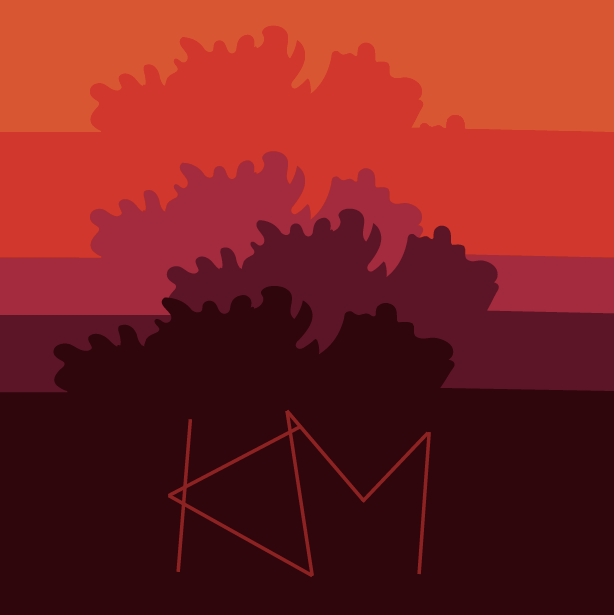
Today, we started the class by going around the room and showing each other our work, talking through our inspirations, methods and outcomes, etc. I learned a lot about the different techniques and styles in Illustrator, finding it really insightful to see what everyone else has been doing (sometimes I get stuck in a creative block and get caught in producing the same styles of work, because I don’t have inspiration for another direction). We then went on a break. When we got back, I wanted to continue working on the image I created yesterday (the one just above). I like it a lot because, although it is very my style of art and design, it still contains traces of the clients initial desires; an aspect of flowers, with the colours pink, black and white (even though the colours aren’t exactly pink, black and white, they are still warm toned, with variations of light and dark of red and pink). I drew inspiration for my next project from previous works I have done through the medium of painting and collaging, where I make layers of different patterns and images. I decided to do a city skyline because it not only contrasts the nature element of the flowers, but also because we had just learned from Marcus about the ability to change the opacity and colour of certain blacks and dark shades that will show up when printed, which I thought had the potential to look really cool in a city skyline, sending certain ‘buildings’ forward, and others back. I made it in a pink/purple/red colour scheme and then did the same exact image but in a green/brown/blue colour scheme. The initials that I used were different again, and were made using curved lines and straight lines. I made an initial version of the initials and kept experimenting and playing with them, ending up with about 4 different variations, choosing the one I liked the most.
Very sad side note: I have just realised that I forgot to email all of the images made today and will have to sadly recreate them, however, I will need to, as I have decided that I am going to use it for my final submission project! 😀 ( I will probably only remake the red colour schemed one as I preferred that anyhow)
